Product Server Control
The Product server control allows site visitors to view the details of a product and add it to their cart. To display a product on a Web page, drag and drop a Product server control on a template and enter a product ID in the DefaultProductID property. You could also dynamically pass a product’s ID to the control by setting DynamicProductParameter property to the QueryString parameter used for product IDs.
This control handles each class of product Ektron provides. This means the Product server control displays Products, Kits, Bundles or Subscriptions without having to make any adjustments to the control.
Site visitors typically reach this server control when they click a product from either the ProductSearch or ProductList server control. When site visitors clicks a product, title or image in either of these controls, they are forwarded to the Product server control.
In addition, site visitors can reach this control from the Cart server control. In that control, site visitors click a product’s title and are taken to the Product server control.
Once a site visitor has viewed the product and decided to purchase it, they click Add to Cart in the control.
Displaying a Product
A product is an item that has no kit, bundle or subscription information associated with it.

When displaying a simple product, the Product server control displays the following information.
|
Area |
Where information comes from |
|
Title (This field is optional.) |
The Title field in the product’s Smart Form. A content editor enters this information when creating a product in the Workarea. This area does not use the title of the product in Ektron CMS400.NET’s Workarea. |
|
Description (This field is optional.) |
The Description field in the product’s Smart form. A content editor enters this information when creating a product in the Workarea. |
|
The Media tab when creating or editing a product. The Gallery Display property for each image on the Media tab must be set to Yes. In the Image Gallery, images are displayed at their smallest size. Once a site visitor clicks an image, the full size version is displayed. Below is an example of a product’s image gallery.
See Also: Entering a Catalog Entry’s Media |
|
|
Price |
The Pricing tab when creating or editing a product. This is the price defined in the Our Sales Price area. This is not the list price. |
|
This button appears in the server control when a path to the Cart server control is defined in the the product is buyable. When a product is not buyable, information about the product is displayed, but site visitors cannot add it to their cart. This property is set in the Workarea when creating or editing a product. the ShowAddToCart property is set to True When site visitors click this button, the product is added to their cart and they are sent to a template containing the Cart server control. You can hide this button by setting the ShowAddToCart property to false. This allows you to show details of a product, but not offer it for sale. For example, you have a product that is no longer for sale, but you want to allow people who purchased the product to view its details. Also, by using code behind to dynamically set the property, you could create code that looks at your inventory system and hides the button depending on whether a product is in stock. |

Using the Add to Cart Button with Aliasing
When a product has an alias path associated with it, you need to do the following:
Make sure the TemplateCart property’s path is relative to the site root. For example:
TemplateCart="Developer/Commerce/CartDemo.aspx"
Add the following to the code behind page. This example is in C#:
protected void Page_Init(object sender, EventArgs e)
{
Utilities.RegisterBaseUrl(this.Page);
}
Displaying a Bundled Product
A bundled product is made up of multiple products that have been grouped together for sale as one product.

See Also: Creating a Bundle
When displaying a bundled product, the Product server control displays all information displayed in a Product as well as the following information.
|
Area |
Where the information comes from: |
|
This Bundle Includes: |
Products listed on the Items tab for a Product Bundle in the Workarea. A content editor adds existing products to this tab when creating the bundle. Any products on the tab are displayed with the image, title and description for each product. A link to additional information about each product is also displayed. |
Displaying a Complex Product
A Complex Product allows the site visitor to choose between variations of a product. For example, if your site sells books, variant selections might be Paperback or Electronic.

See Also: Creating a Complex Product
When displaying a Complex Product, the Product server control displays all of the information displayed in a Product in addition to the following information:
|
Area |
Where the information comes from: |
|
Variants: |
Products listed on the Items tab. A content editor adds products to this tab when creating content. Products on the Items tab are displayed with a radio button, image, title and description. A link to additional information about each product is also displayed. The radio buttons are used to select which product will be added to the cart. |
Displaying a Kit
A kit allows the site visitor to select product options, which can affect the product’s price. There is no limit to the types of options you can add, nor to the number of items in an option. For example, a site visitor purchasing a computer can add RAM, a hard drive, and a larger monitor.

See Also: Creating a Kit
When displaying a kit, the Product server control displays all information displayed in a product in addition to the following information.
|
Area |
Where the information comes from: |
|
Options |
The Item tab for a kit in the Workarea. Options are divided into groups. A radio button, name and price appears for each item. The radio button allows you to select one item from each group. |
|
Subtotal: |
The updated cost of the product with all options. |
Product Server Control Properties
The following table explains the properties of the Product control.
Note: The following table only lists Ektron-specific properties. It does not describe native .NET properties such as font, height, width and border style. For documentation of these properties, see Visual Studio help.
|
Property |
Description |
Data Type |
|
Authenticated |
Indicates if you are logged in to the CMS Explorer and can use it to browse to Content, Collections, etc. See Also: Working with Ektron CMS400.NET Server Controls |
String |
|
CacheInterval |
Sets the amount of time the server control’s data is cached. The default is 0 (zero). This is the amount of time, in seconds, a control’s data is cached. For example, if you want to cache the data for five minutes, set the CacheInterval property to 300 (three hundred). See Also: Caching with Server Controls |
Double |
|
CustomXml (Code Behind Only) |
Enter a string of XML that you want to make available to the XSLT. This property provides a mechanism to inject custom XML into the generated XML before being processed by the XSLT. The sting is added inside the CustomXml tag as follows: <root><customXml>custom-xml-inserted-here</customXml></root> |
String |
|
DefaultProductID |
Enter a default product’s ID. This is the default product that’s displayed when the template containing this control is viewed by a site visitor and a product ID is not dynamically passed. To make this server control dynamic, enter zero (0) for this property and set the DynamicProductParameter to the QueryString parameter used to pass the product ID. |
Integer |
|
DisplayXslt |
Specify an external XSLT file to render the control. By default, the control uses product.xsl. This file is located in Important: If you want to edit this file, it is strongly recommended that you make a copy, change its name and move it outside your site’s Workarea folder. If you make changes to this file and do not move it out of the Workarea folder, this file and the changes will be lost when you upgrade. |
String |
|
DoInitFill |
By default, Fill occurs during the Page_Init event. Set to false if you want to postpone the fill-action until later. In this case, FIll is automatically called during the Page Render event. You might do this if you need to set or change a property on the control in codebehind and have it render with your changes shown. |
Boolean |
|
DynamicParameter |
The QueryString parameter name which is used to read the product ID. For example, if your QueryString parameter for products is ID, enter that in this property. Then, when site visitors views a product’s details, the product’s ID is passed to this control. |
String |
|
Hide |
Used to hide the control in design time and run time. True = Hide the control False = Show the control |
Boolean |
|
ImageGallery |
Determine if the image gallery is displayed along with a product’s information. Images that appear in the gallery are set in the Workarea’s Media tab when creating or editing a product. The Gallery Display property for each image on the Media tab must be set to Yes. Note: To set images on the Media tab, thumbnail information must be defined on the Media Defaults tab at the Product Type level. See Also: Media Defaults Tab Choices are: List = display gallery images None = hide gallery images In the Image Gallery, images are displayed at their smallest size. If a site visitor clicks an image, a full size version is displayed. See Also: Image Gallery |
ImageGalleryType |
|
Language |
Set a language for viewing product information. This property shows results in design-time (in Visual Studio) and at run-time (in a browser). |
Integer |
|
OverrideXslt |
Specifies an XSLT identified in the Edit Product Type Configuration screen. See Also: The OverrideXslt and DisplayXslt Properties. |
Integer |
|
ShowAddToCart |
Set to true if you want to the Add to Cart button to appear. The default is True. See Also: Add to Cart button Setting this property to false allows you to show details of a product, but not offer it for sale. For example, you have a product that is no longer for sale, but you want to allow people who purchased the product to view its details. Also, by using code behind to dynamically set the property, you could create code that looks at your inventory system and hides the button depending on whether a product is in stock. You could also accomplish this for a specific product by removing the check from the Buyable property when creating or editing a product in the Workarea. |
Boolean |
|
SuppressWrapperTags |
Suppresses the output of the span/div tags around the control. The default is False. True - Suppress wrap tags. False - Allow wrap tags. |
Boolean |
|
Stylesheet |
Specify the location of a style sheet to use for the product page. Set the location relative to the site root folder. |
String |
|
TemplateCart |
Enter the URL path of the template that contains the Cart server control. This path can be relative or absolute. See Also: Cart Server Control and Using the Add to Cart Button with Aliasing. |
String |
The OverrideXslt and DisplayXslt Properties
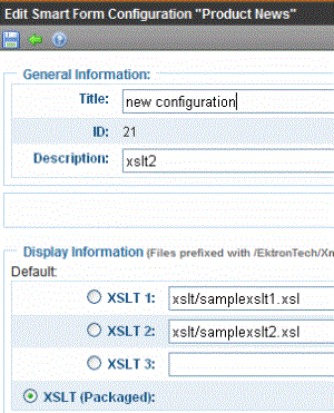
The DisplayXslt property is optional. If used, it specifies an external XSLT file. If the DisplayXslt property is not defined, the OverrideXslt property specifies an XSLT identified in the Edit Product Type screen. The following table provides more information about these properties.
|
To use this display XSLT |
Enter this value for DisplayXslt |
Enter this value for OverrideXslt |
|
The default XSLT specified in the Edit Smart Form Configuration screen (illustrated below). Note that, in this example, the XSLT Packaged option is the default XSLT, since it is selected. XSLT Packaged is the XSLT from the Edit Smart Form Configuration screen (that is, the XSLT created in the Data Designer).
|
|
0 |
|
XSLT 1 from the Edit Smart Form Configuration screen |
|
1 |
|
XSLT 2 from the Edit Smart Form Configuration screen |
|
2 |
|
XSLT 3 from the Edit Smart Form Configuration screen |
|
3 |
|
An absolute or relative path to an XSLT file. |
An external XSLT file not specified in the Edit Product Type Configuration screen. For example sample.xslt |
does not matter - if XSLT value exists, OverrideXSLT is ignored |